The LIES That Make Hardware ACTUALLY Work


Channel: Enrico Tartarotti
Uploaded by Enrico Tartarotti on 20260731
Categories: Science & Technology
Tags: enrico tartarotti, enrico, tartarotti, enritarta, tech
Try Cursor today: https://cursor.com/?utm_source=youtube&utm_medium=yt-integration&utm_campaign=evergreen -------- I'm building Flask, the best video collaboration tool I've ever used: https://www.flask.do Instagram: https://www.instagram.com/enritarta/ Follow me on X: https://x.com/EnriTarta If you're a brand trying to reach

The video "The LIES That Make Hardware ACTUALLY Work" by Enrico Tartarotti explores the hidden, complex design choices, engineering feats, and psychological details that make everyday physical technology feel satisfying and high-quality.

1. The Engineering of Simple Mechanisms (AirPods Case)

The Problem: The lid of an AirPods case needs to stay securely closed so the headphones don't fall out, but it also needs to feel satisfying to open and close without fee
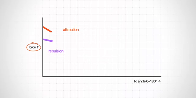
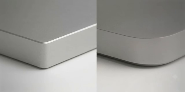
Image for chunk 1

ling stiff or awkward [00:15].

The Solution: Hidden beneath the plastic are four magnets—two in the front attracting each other, and two in the back repelling each other [00:47]. Apple engineers meticulously calculated the magnetic forces and angles to create a precise "cut-off point" where the lid naturally snaps fully open or fully closed [00:42].

2. The Four Building Blocks of Physical Tech

Block 1: Curves and Surface Continuity

The Concept: Edges on physi

Image for chunk 2

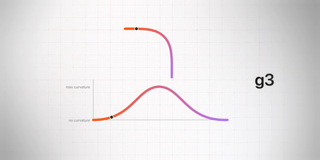
cal products are rarely sharp because they would be painful to hold [02:11]. Simple chamfered edges are called G0, while standard rounded circles create G1 curves where the curvature changes abruptly [02:16].

Premium Design: High-end products like MacBooks and Teenage Engineering devices use G2 (or even G3) curves, where the curvature smoothly increases and decreases along the corner, creating seamless light reflections and a premium hand-feel [02:53].

Block

Image for chunk 3

2: Buttons and the "Tactile Ratio"

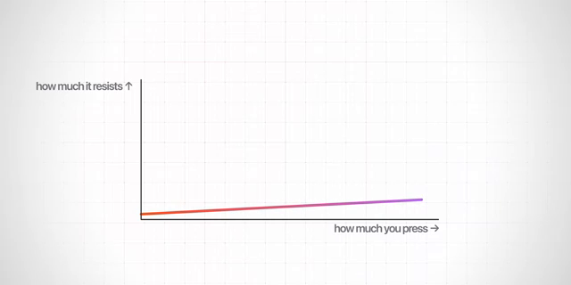
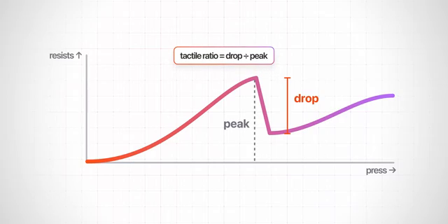
The Mechanism: A basic button is just two pieces of metal touching, which feels mushy and unsatisfying [04:48]. Real physical feedback relies on a tiny steel dome that bends and resists pressure until it suddenly collapses [05:15].

The Tactile Ratio: The drop in force when the dome collapses creates a distinct "click cliff" that fingers perceive as quality [05:27]. While higher tension ratings feel more satisfying, they wear

Image for chunk 4

out faster, forcing manufacturers to balance feel, cost, and durability [06:30]. A historical misstep in this area was Apple's 2015 butterfly keyboard, which drastically reduced key travel and led to reliability issues due to dust sensitivity [06:45].

Block 3: Materials and Thermal Effusivity

The Choice of Material: Injection-molded plastics can show cooling imperfections on large, glossy surfaces (like the center piece of a PlayStation 5), making them look

Image for chunk 5

cheaper unless matte finishes are applied [09:09].

Why Metal Feels Better: Premium materials like aluminum feel colder not because of their base temperature, but because of effusivity—the rate at which a material draws heat away from your hand (aluminum draws roughly 30 times more heat than plastic) [10:40].

Block 4: Hardware and Software Fusion

Seamless Integration: The most magical user experiences happen when hardware and software work as a single unified

Image for chunk 6

system [11:11].

Examples: Synthesizers like the Teenage Engineering OP-1 and TP-7 map their physical knobs and rotating discs directly to digital software parameters, mimicking real-world physics (like digital vinyl scratching) [11:38]. Similarly, Apple's Dynamic Island turns a physical hardware cutout into a functional software element [12:44].

https://www.youtube.com/watch?v=wLIgrGAIRsE

The LIES That Make Hardware ACTUALLY Work

Enrico Tartarotti · 231K view

No image available for chunk 7

Viewer Discussion & Comments

@enricotartarotti
Try Cursor today: https://cursor.com/?utm_source=youtube&utm_medium=yt-integration&utm_campaign=evergreen
@NicolaChecchiii
Another thing that feels cheap is leaving the gemini watermark on the generated example images :/
@AlexAlcyone
people forget, rounded corners going to square and then back to rounded is a cyclical trend. When everything is saturated with rounded corners, the new trend will become square again. Guaranteed. Tahoe is stupid tho
@thmusic7214
nah, sharp corners look more premium to me now, EVERYTHING is rounded now. It is now hip to be square.
@krikusZ80
The obsession on rounded corners in modern software is a nightmare for UX. less space, i feel like in a kindergarten
@thepizzacarpizza1056
A chamfer is a cutoff
@kensnzbr4137
This whole video sounds like somebody who made a bad and expensive Apple purchase and is now trying to convince himself that he bought a genius product
@secretised
They're also the best "bomb" when they explode in all directions. But the airpods are not the only victim..
@nemma9
I doesn't feel premium using a rounded corner, its just "feels Apple" what a lots of peoples are associating with a premium product.
@Paarthk
11:35 the pipe animation is too long. It would get annoying quickly and feel cheap again.
@Nintendo_200
10:10 bro left a AI image with the Gemini watermark in a such a professional video 😮
@kuzonio
Great video, just a note on AirPods. The hinge was designed not with four but a series of sixteen neodymium magnets with the intention of pushing out in the opposite direction of movement past a tipping point both forward and backwards, the system is also designed to understand fidgeting so a window doesn’t pop up on your phone every time you open the case.
@efkastner
1:21 there’s also a spring and some sort of linkage?!? I’d love to see a giant transparent version of the case
@mayanksh3khar
The apple gloating is strong with this one
@Gornius
0:49 - opposite poles attract, the same repel each other. There are two pairs of magnets that repel each other in that visualisation.