These climate change charts are wrong. Here are the real versions.


Channel: ReasonTV
Uploaded by ReasonTV on 20260205
Categories: News & Politics
Tags: libertarian, Reason magazine, reason.com, reason.tv, reasontv, Aaron Brown, stats, numbers, math, charts
The job of scientists isn't to manufacture alarm. It's to communicate the truth. reason.com --- Sensible progress requires honestly evaluating climate change and devising realistic strategies to address it, not manipulating data to generate hockey sticks. The job of scientists isn't to manufacture alarm. It's to communicate the tr

This response provides a detailed overview of the content and arguments presented in the ReasonTV YouTube video, "These climate change charts are wrong. Here are the real versions."

The video argues that while global warming is a real phenomenon, certain climate scientists and media outlets manipulate data to generate misleading, scary-looking "hockey stick" graphs. The video asserts that this incites public panic and leads to poor policy decisions, whereas representing the data honestly provides a clearer, more constructive picture of the climate.

Key Themes & Graph Analyses

1. The Legacy of the "Hockey Stick" Graph

The video traces the trend of alarming climate charts back to the original 1998 "hockey stick" graph created by climate activist Michael Mann [00:40].

The Critique: The video states that Mann's graph oversimplified complex climate
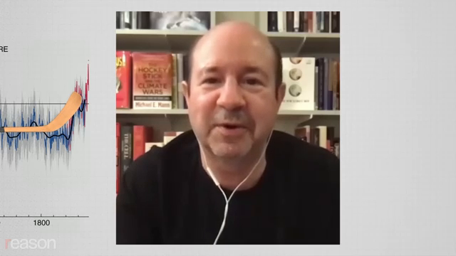
Image for chunk 1

physics to tell an "unprecedented warming" story [00:53]. It accuses Mann of using biased statistical methods, stitching together unreliable proxy data, and grafting on a "scary red line" that was unrelated to the rest of the historical dataset [01:16].

2. The US Temperature Record Ratio Chart

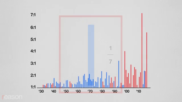
The US Government’s Global Climate Change Research Program published a chart showing a stark increase in record-high temperatures using red and blue bars to represent ratios [01:29].

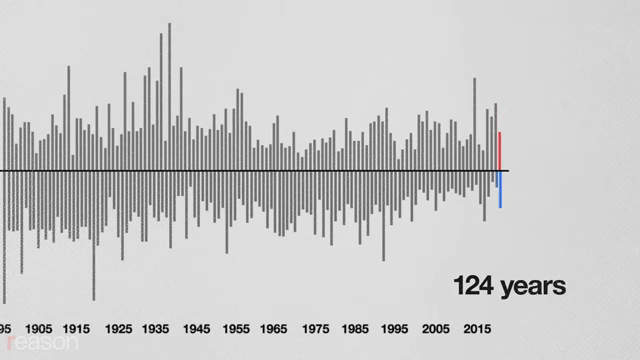
The Critique: The video argues that using a ratio is a visual trick [01:59]. As physicist Steven Koonin pointed out in his 2021 book Unsettled, the actual number of record-hot days in the US is not increasing. Instead, the number of record-cold days is decreasing [02:24]. Because the denominator (record cold days) is shrinking, the ratio artificially spikes [03:00].

The Mat

Image for chunk 2

h Illusion: Additionally, the chart defines a "record" day starting from 1895. In the early years, records were easy to set. By 2018, a day had to beat 124 years of data to be a "record" [02:48].

Visualizing the Difference (Conceptual Representation)

The Government's Ratio Chart (Spiking)

Plaintext

Ratio (Highs/Lows)

^

| █

| █

| █ █

| █ █ █

| █ █ █ █

+-------------------> Time (1930s - Present)

(Creates the illusion of skyrocketing hot days)

The Real Data (Koonin's View of Record Warm Days)

Plaintext

Number of Record Warm Days

^

| █

| █ █

| █ █ █ █

| █ █ █ █ █

+-------------------> Time (1930s - Present)

(Highest temperatures actually peaked in the 1930s Dust Bowl era)

3. Global Record Temperature Charts

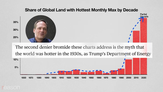
The video critiqued a chart by climate sci

Image for chunk 3

entist Zeke Housefather, which showed the percentage of the globe experiencing record-high temperatures by decade [03:33].

The Critique: The video argues that global temperature data from the 19th century is highly unreliable [04:07]. The historical "rise" in record temperatures partly reflects the fact that we have vastly more and better-quality measurement tools today than we did in the 1850s [04:13]. When adjusting for measurement uncertainty and data quantity, the dramatic "hockey stick" shape disappears, though a gradual, statistically significant warming trend remains [04:34].

4. Weather Outliers vs. Climate Averages

The video emphasizes that graphing extreme record temperatures is a measure of local, short-term weather, not climate [04:48].

The Analogy: Measuring climate change by tracking only record-hot temperatures is compared to mea

Image for chunk 4

suring human life expectancy trends by only looking at the age of the oldest person who died in a given year [05:02]. It focuses on idiosyncratic outliers rather than the average.

Responsible Ways to Visualize Climate Data

The video suggests three honest alternatives to track climate and environmental progress without manufacturing alarm:

Graphing Global Heat Minimums: Visualizing the disappearance of record-cold months [05:22]. This shows the most dramatic, unambiguous effect of global warming (the planet is getting less cold, rather than extremely hotter) [05:29].

Global Mean Temperature Anomaly (1880–Present): A steady, non-hockey-stick chart showing gradual, accelerating warming that could bring the Earth near a 2°C increase by 2060 if current trends continue [05:42].

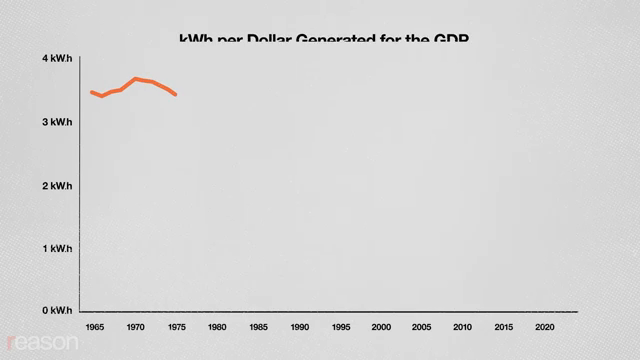
Energy Efficiency and GDP: A chart measuring the kilowatt-hours of energ

Image for chunk 5

y needed to generate a dollar of real GDP in the US [05:56].

Plaintext

Energy Intensity (kWh per Dollar of US GDP)

^

| \

| \

| \

| \__ 60% reduction since 1965

| \___

+-------------------> Time (1965 - Present)

This final chart shows that the US requires 60% less energy to produce the same amount of wealth today as it did in 1965, proving that nations can sustain economic growth while reducing their environmental footprint [06:02].

Conclusion

The video concludes by stating that the role of scientists is to communicate the truth, not to manufacture alarm [06:21]. Addressing climate change effectively requires honest evaluations and realistic strategies, rather than relying on manipulated statistical tricks to frighten the public [06:21].

These climate change charts are wrong. Here are the real versions.

ReasonTV · 484K v

Image for chunk 6

Viewer Discussion & Comments

@ReasonTV
Is this video a 'masterclass in manipulation'? That's what YouTuber Hank Green says.
@M.A.Tremblay
I came here to never come back.
@kalisalpetermix
4:45 my guy, your own graph on the left IS terrifying
@michaelrosenbaum3985
2:23 Wait, but if the number of record high temperature days is remaining stable, that would mean that the global average temperature is increasing at a constant rate over time. Those new records have to replace old records. Meanwhile, the if the number of record cold days is decreasing over time, that would mean that temperatures are not getting colder over time at the same rate they are getting warmer. Honestly, that graph is just as scary as the original. But it just has more data presented to the reader. Which might be a good thing. But it also might just obfuscate the real conclusion of the graph
@kalisalpetermix
2:35 the number of record high temperatures is not holding steady… IN YOUR OWN GRAPH!!!